Cheyney's
Building a regenerative farming brand in a modern sustainability aesthetic
Identity, marketing assets and website for a Hertfordshire regenerative farming venture, built to stand apart in a category where every other eco brand uses the same visual language.
Brief
Grounded in tradition, with a distinctive visual language.
Cheyney's regenerative farm in Hertfordshire uses soil-restorative methods that go way past conventional sustainable agriculture. The task was specific: build an identity for their launch that reflects their approach, reads as commercially confident, and avoids the more generic category norms.
Insight
Authenticity signalled the same way becomes cliché.
Spend an afternoon in the regenerative farming category and it blurs into one brand. Muted greens, browns and creams. Rustic type. Hand-drawn marks. The same three moves everywhere so none of them register. Cheyney's needed to look like its future-facing values and stand out in its sector.
Build
A contemporary read on a timeless practice.
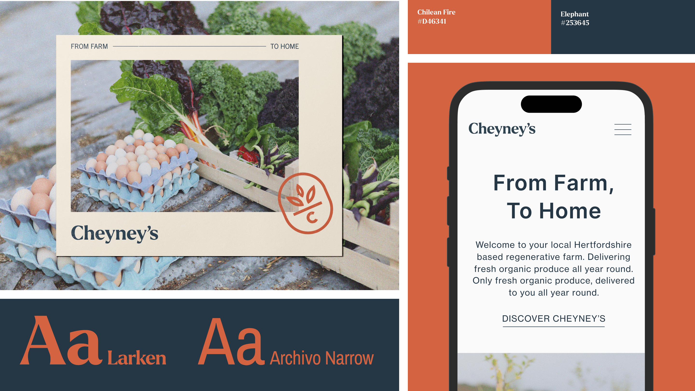
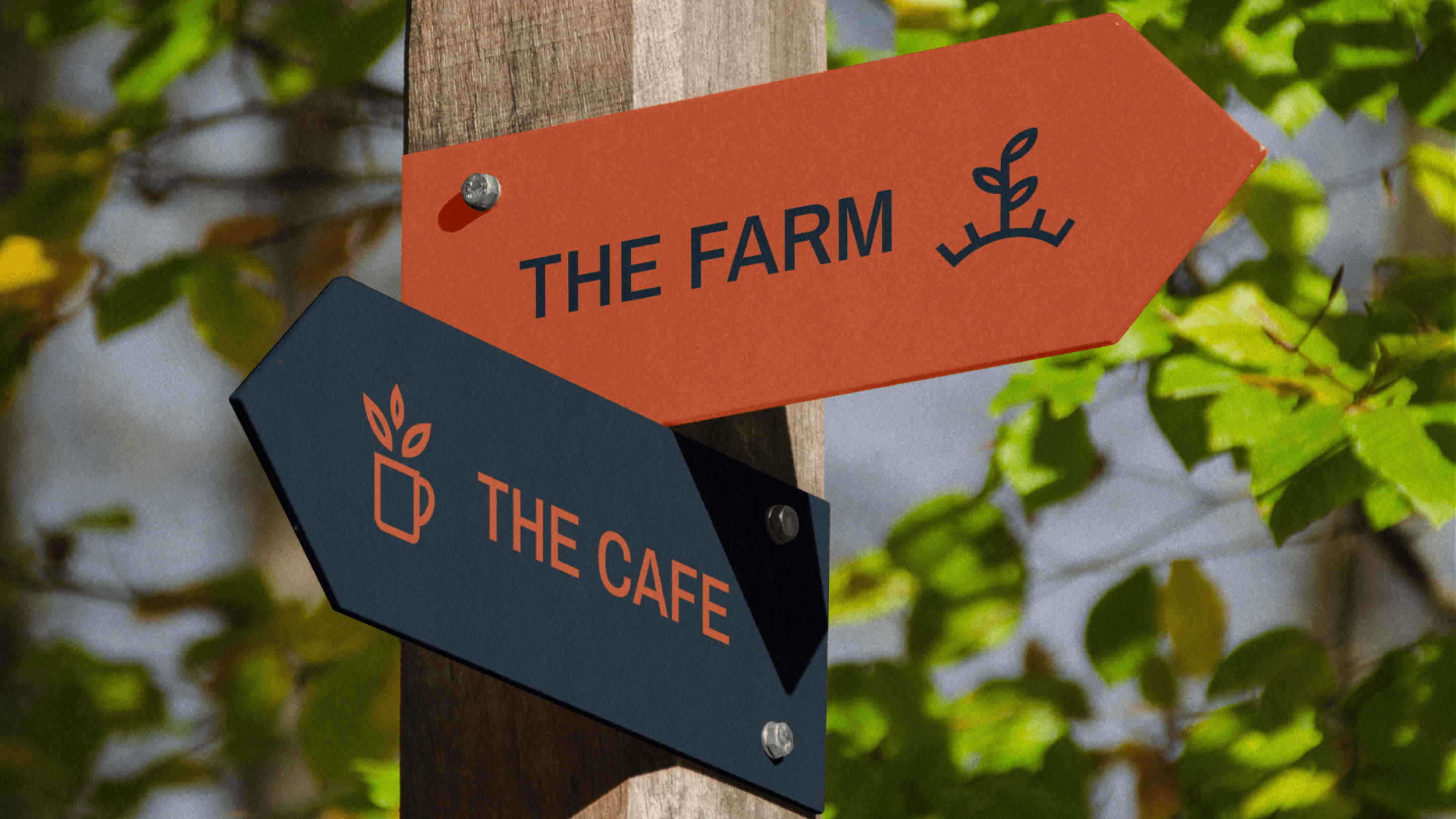
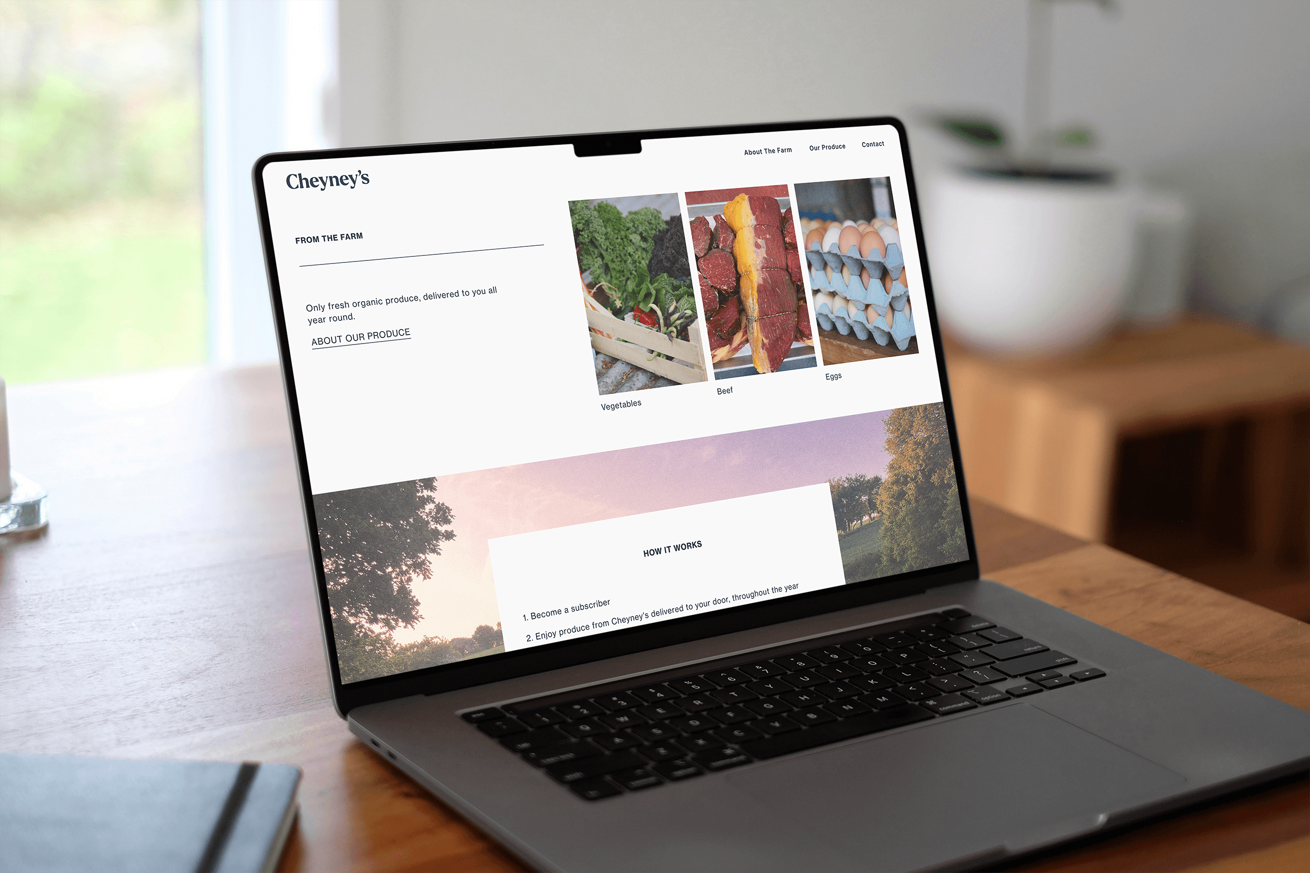
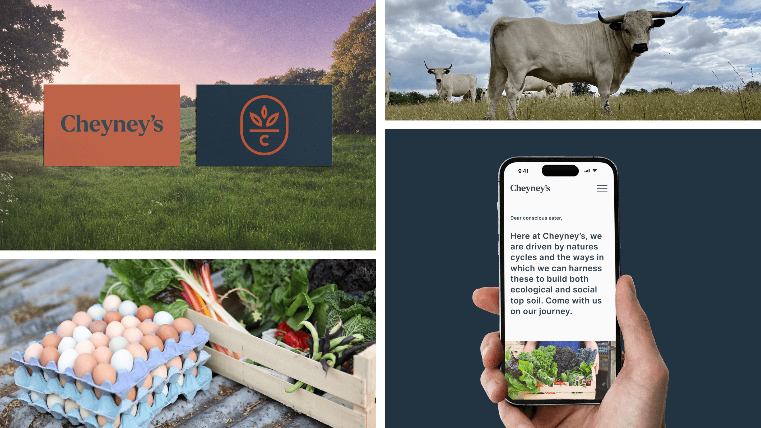
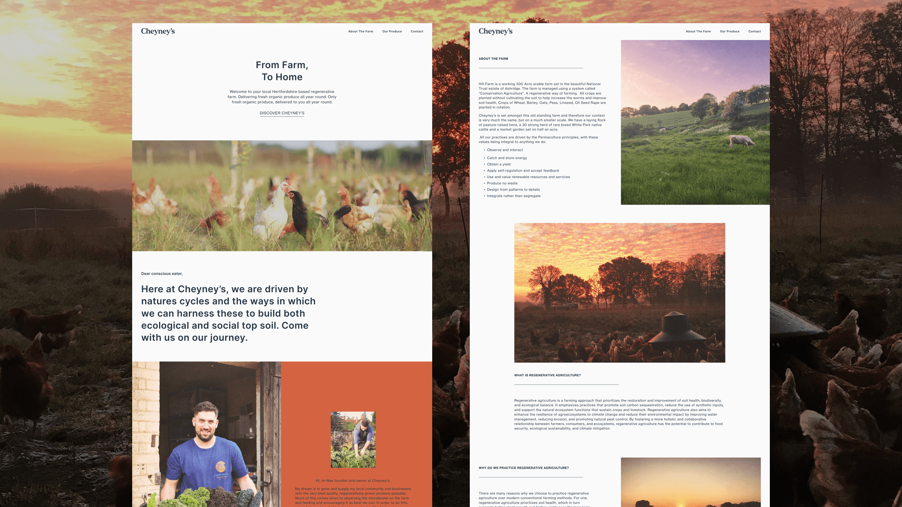
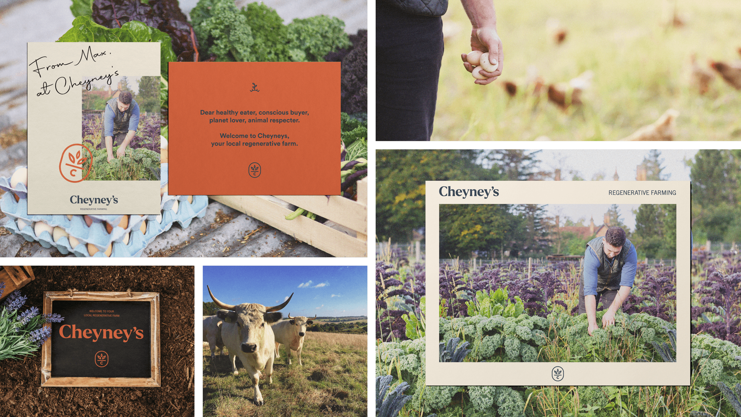
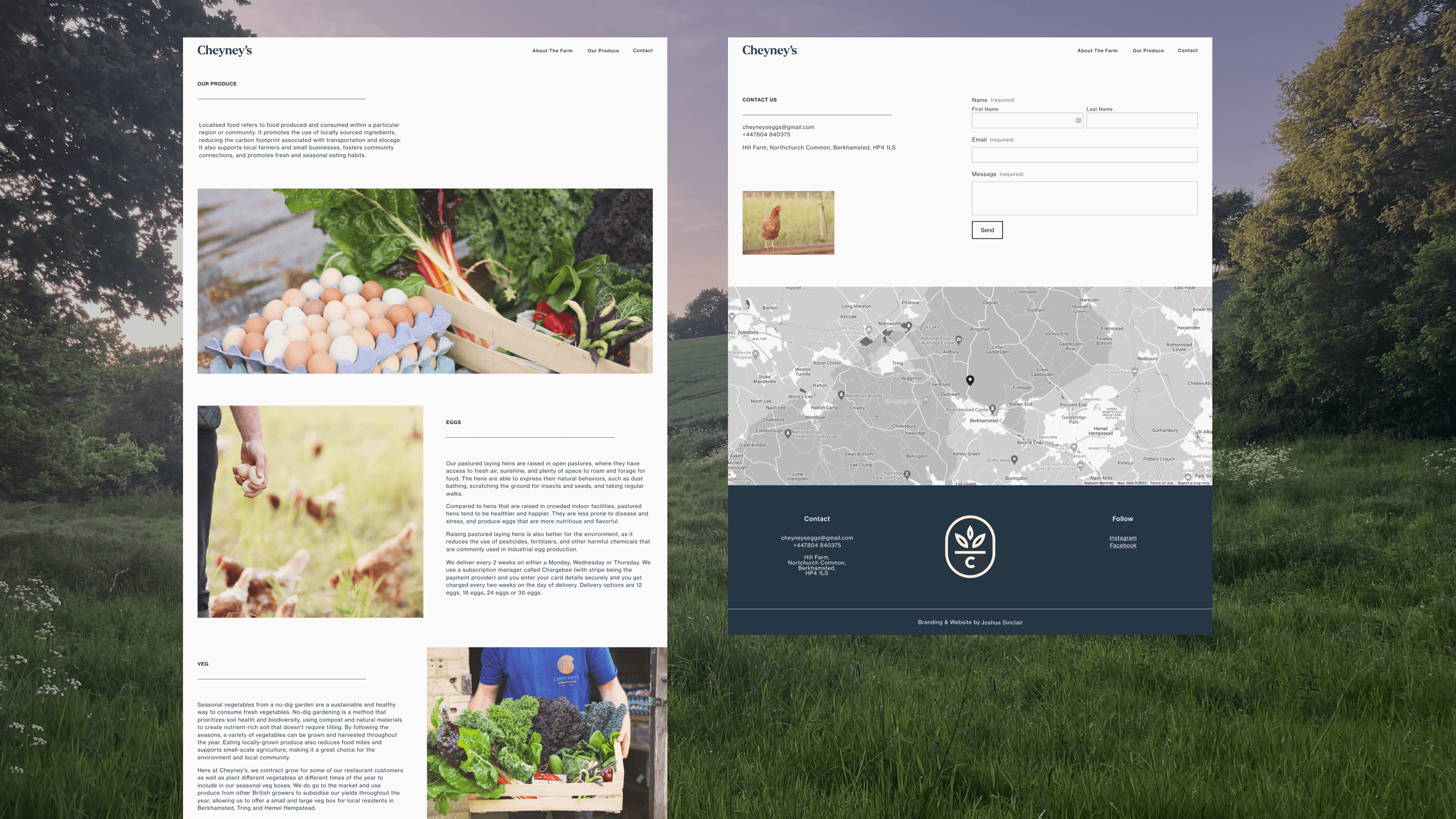
The identity takes traditional farming aesthetics through a modern lens. A bold orange and blue palette the category does not use. A minimalist, textured system that holds both ideas at once: grounded, and clearly current. Then the assets to carry it. Print and digital assets for real-world application, and a website that brings the identity to life and supports customer engagement.
Positioned to launch with a strong market presence, and still growing today.
The identity holds against a sector, and the system has kept extending across new product lines since their launch.
Testimonial
"A bold, vibrant brand identity that sets us apart from traditional sustainable farming brands. The creative strategy, marketing assets and website have all strengthened our positioning and customer engagement. Professional, insightful, and highly collaborative."
Max Dudley, Cheyney's